Loading
We design intuitive, beautiful interfaces backed by real user research — from wireframes and prototypes to complete, scalable design systems.
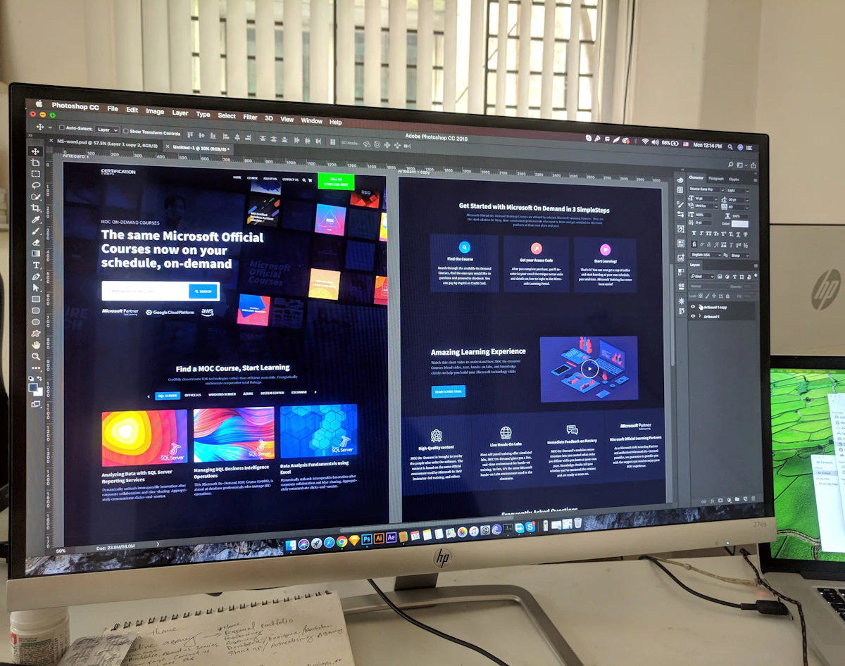
Great products start with great design. We combine user experience research with striking visual design to create interfaces that are effortless to use and a joy to look at.
From wireframes and user flows to interactive prototypes and full design systems, we craft consistent, responsive experiences that reduce friction and boost conversions.
A complete set of solutions delivered by a team that sweats the details.
Clean, modern interfaces designed for touch and delight.
Striking, on-brand web interfaces that convert visitors.
Low-fidelity blueprints that align everyone early.
Mapped journeys that make every path intuitive.
Clickable prototypes to test and validate before build.
Complex data made clear, usable and beautiful.
Reusable components for consistency at scale.
Designs that adapt gracefully to every screen size.
Insights from real users that guide better decisions.
A proven, transparent process from first idea to launch and beyond.
We map your goals, users and scope to define a clear, actionable roadmap.
Wireframes and interactive prototypes validate the experience before we build.
Agile sprints turn the design into clean, tested and production-ready code.
Functional, performance and security testing on real devices and browsers.
Smooth release to your servers, app stores or the cloud with zero downtime.
Ongoing monitoring, updates and enhancements keep everything running.
We've delivered results across a wide range of sectors and business sizes.
Experienced people, secure solutions and a commitment to doing it right.
Senior engineers and designers with years of hands-on delivery across industries.
Security best practices, encrypted data and role-based access baked into every build.
Clean, modular architecture that grows painlessly as your business scales.
Transparent milestones and agile sprints keep your project on schedule.
Regular demos, shared boards and a single point of contact from day one.
Post-launch maintenance and support plans so you are never left stranded.
Attractive screens are the easy part. What separates a design that ships from one that gets quietly redrawn in code is everything below.
A screen in a design file is usually the happy path: a list with six perfect rows, a profile with a complete photo, a dashboard with tidy numbers. Real software spends a lot of its life in the other states, and if those are not designed, a developer invents them at 11pm and the result looks nothing like the rest of the product.
So for every meaningful screen we design four more:
Beyond about fifteen screens, designing page by page starts producing drift: four button heights, three shades of grey, spacing that is 14px here and 16px there. It looks fine in isolation and cheap in aggregate.
We work from a small set of decisions instead — a type scale, a spacing rhythm on a consistent grid, a fixed palette with defined semantic colours for success, warning and danger, one elevation model, and one radius scale. Then components are built from those decisions: buttons in their full range of states including disabled and loading, form fields with label, help text and error, tables, modals, empty states, toasts. New screens become assembly rather than invention, which is faster for us and far cheaper for whoever extends the product next year.
Most accessibility problems are created in design and merely inherited by engineering. The ones we design around from the start: text contrast that holds at real body sizes, and specifically not light grey on white for anything a user must read; never using colour alone to signal state, so an error has an icon and text rather than only a red border; focus states that are visibly designed rather than left to the browser's default outline; tap targets at least 44px with adequate spacing; and a heading structure that is a genuine hierarchy rather than a set of font sizes chosen by eye.
There is also a layout consequence people miss: designs must survive a user increasing their text size. Fixed-height containers with tightly fitted text break immediately. Designing with flexible containers costs nothing at the time and prevents a category of bug reports.
Formal research programmes are out of reach for most projects, which is used as an excuse to do none. That is a false choice. Cheap research that consistently changes our designs:
A beautiful file with no specification generates a week of questions. What we hand over alongside the visuals: spacing and sizing as tokens rather than eyeballed values; every interactive state drawn; behaviour notes for what happens on tap, on submit, on failure, on slow network; responsive intent for each significant block, since a developer should not have to guess what a three-column grid becomes on a phone; copy as final text rather than lorem ipsum, because length changes layout; and exported assets at the right densities with SVG for anything vector.
We also stay involved during the build. Design questions surface constantly once code meets real data, and a designer who has disappeared is how products drift away from their own design system.
Redesigns are often commissioned because a product feels dated, then judged afterwards on metrics nobody baselined. Two things go wrong repeatedly. The first is changing everything at once, which makes it impossible to tell which change helped and guarantees a wave of complaints from users whose habits you broke. The second is redesigning the surface while leaving the underlying flow untouched — if a task takes nine steps, a nicer-looking nine steps is not an improvement.
Our approach is to measure the current state first, identify the two or three flows that carry the most traffic or the most frustration, and change those properly rather than repainting everything. It is less impressive as a reveal and considerably more likely to work.
On a typical product build, design is meaningful but not dominant — usually somewhere between a fifth and a third of the total, front-loaded. It is also the cheapest place to change your mind: moving a button in a design file costs minutes, moving it after it has shipped across two platforms costs days. That asymmetry is the entire argument for doing design properly rather than treating it as decoration applied at the end.
For how design fits into a full project estimate, see our phase-by-phase cost breakdown. For how specification and design interact, our guide to writing a requirements document covers the states-and-acceptance-criteria discipline from the other direction.